The Context
House2Home is a digital storefront for finding furnishing and home accessories for everyone looking to add just a little more flair and liveliness to where they live. H2H is currently looking to add a new product set to their current list of available products. This new range of items are referred to “Starter Kits” sets of items that aren’t full blown furniture items, but are focused on people who are just moving into a new apartment or small space and want smaller, themed items to make their new place of living comfortable.
To develop this new section of their website, the use of a modified GV design sprint was implemented. Over the course of five days, this new aspect of the site will be mapped, sketched, storyboarded, prototyped, and tested.
The Problem
Moving into a new apartment is a daunting challenge for any young person, especially moving into a space with not a lot of room to decorate. Knowing exactly what items to buy for your particular space is a challenge, even more so when you don’t have the item right there in front of you, in your space to see how it works. Committing to purchasing items that you may find that you hate, or that they don’t fit the theme you’re going for is a scary prospect, especially after moving into a new home with little money to spend on decorations.
The Solution
So how do we solve this? After reviewing the user research, I set about creating a lightweight design that would promote the easy to codify nature of starter kits into separate themes that could then be sorted by item amounts, apartment sizes, colors, and themes. This design would also let users preview items in a mock 3-D space so they could place items in pictures of either their own home or homes that look similar so they could make educated purchases.
My Role
As this is a modified GV design sprint, I was the sole designer on this project. Taking the user research that was provided by the company I went through each of the 5-day steps to create this design.
Day 1: Understanding and Mapping
Understanding the problem
After reviewing the user interviews that House2Home had conducted before my involvement in the design process I took several sticky notes of the main problems users were facing with the problem when it came to finding furnishing for their homes/apartments. These users were mostly focused on younger adults who were moving out on their own for the first time, or younger adults who had recently moved into a new space and didn’t have many accessory furnishings with them.
The overwhelming consensus throughout these interviews boiled down to three main problems:
Budgetary concerns: Most users expressed worries that they wouldn’t be able to make the most of the their money to furnish their space or wanted to keep their purchases to a specific price points
Indecision when it came to purchasing items: Users expressed frustrations or trepidation when it came to finalizing purchases as they weren’t sure if the things they were buying were going to look good in their space
Unclear on theming of items: Users also expressed pain points of knowing what they were looking for theme wise, but were unclear on what items to purchase to fit this theme.
Site Map
Once these insights were pulled from the interviews I set about making a site map for the design that I was going for. I wanted this design to be straightforward and easy to use for the users who were simply looking for easy to find, theme starter kits for their homes. So with this in mind I created a site map that would focus on filtering what users were looking for, an easy to visualize set of previews, as well as the ability for users to both preview the items in a given starter kit through a picture they can upload or by previewing the items side by side so the user may make an educated purchase.
Day 2: Sketching the Solution
Lightning Demos
Once my site map was decided I set about getting inspiration for the initial design which would have me looking at multiple furnishing based websites. These three websites that I looked to for guidance in what would create a more streamlined shopping experience were: IKEA, InspireMe!, and Wayfair.
Ikea
I enjoyed the layout of IKEAS’ products, especially in terms of kits. All of the items are layed out next to each other in an easy to understand way so the user can see how all the items will look next to each other.
This goes along with the item previews when you click on the associated item, giving the user multiple angles of the piece as well as a 3d viewer.
InspireMe!
The way that InspireMe! utilizes their filters in an eye-catching, and understandable way is what I enjoyed most when looking through their website. How the filters are very expansive when you click on their drop down menus.
The layout of items is also very nice and the purchase screen shows the items in big previews so you can see exactly what it looks like.
Wayfair
Layout of the website is very concise and easy to understand. Items are layed out categorically in terms of what the item is, where it would go, and colors. Easy sort by button can be used in conjunction with the filters so the user can easily sort the theme kits by price if they are on a budget.
Crazy 8s Exercise
With my inspirations and guidance found from looking through competitor websites, I set about on the goal of brainstorming what I would like my design to finally look like. To do this I started up on the crazy 8s exercise to quickly pull ideas from my head and transfer them onto paper, going over them, and then finally choosing the style of page I’d like to go forward with in the final design.
My initial idea upon starting this exercise was to include all of the sorting and filters at the very top page so that I could utilize more of my space for pictures and headers. Though as I continued to think about as I went along in the exercise, I could still make lots of room for all of those things, but having an easy to see filter list would help the users far more in the long run than eye-catching imagery.
Along with this conundrum I found myself in, I had also briefly entertained the idea of adding a step by step guide that a user could click through to then suggest them a starter kit to purchase or setting their filters for them based on the questions they answered. But I decided against this idea as it seemed like it would cause more confusion for the user in the end than just simply having a concise list of filters for the user to click on themselves
Once I was finished I concluded that the home page with the boxed filters screen was to be one of my more critical screens, followed by the screen that would allow the user to place an image of their space to place objects in a kit. These two screens were the solution that I came up with for the pain points pinpointed in the user research: budget to be adjusted by filters, previewing in their space for the anxiety of buying something that the user is unsure will look good, and the issue of theming which would be solved by the addition of a theme filter.
The Solution Sketch
Day 3: Deciding and Storyboard
What we Decided
After this sketch was created I set about deciding on the direction that I wanted my prototype to go in. I was pretty dead set on creating a fairly basic, straightforward, and easy to use set of steps for the user to take in their search for the items they wanted. I wanted to focus on the user’s ability to filter through the starter kit page to find the exact set of items that really jumps out at them.
Once the user finds that kit that really speaks to them, I wanted to give the user the ability to really pinpoint that they’re getting the item that will really make them happy with the ability to preview the items in depth. These previews will be both a detailed side by side of all the items together with lots of pictures of the items in several colored backgrounds and lightnings. I also wanted to implement the ability for the user to take an image of their home to upload to then drag and drop images of the items into their space to really get a feel of how things will look in their home.
The Storyboard
Day 4: Prototyping
The Final Prototype
Link to the Marvel prototype: https://marvelapp.com/prototype/c68j2cj/screen/94225170
Once this storyboard was finalized I set about creating the prototype in Marvel which would allow me to easily and efficiently create a usable prototype with pre-made assets.
It would be assumed that the user had logged into the House2Home webpage and seen the new section of the website dedicated to starter kits where the user would be forwarded to the first screen of the prototype which is the starter kit page.
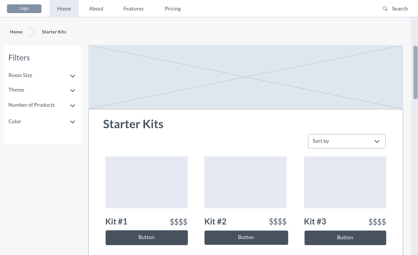
Once on this main page the user could go about setting filters for the specific items they’re looking for. These filters would be primarily focused on: size of the space, the theme the user is interested in, the number of products included, and the color. The user could then also sort by price from high to low and vice versa, the featured products, and the recommended.
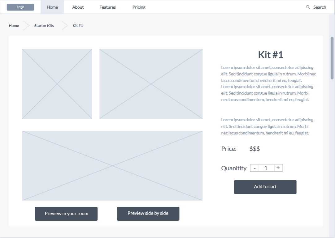
Once the user clicks on a skit, they will be taken to the kit page, where there would be a short description of the items included, as well as their dimensions, make, number of products included, and anything else that could be associated with any sort of furnishing accessory. This page would also include a small number of preview imagery of the items in a stock setting of the company’s choosing. With the two buttons on the bottom, the user could decide to preview these items further side by side or by going to a separate overlay that would allow them to preview the items in their own home.
If the user clicks on the “preview in your room” button an overlay will appear over the kit page that would allow the user to insert an image. This could either be done by uploading an image from their computer, or by choosing a number of stock imagery from the company so the user can find a room that looks similar to theirs. Once this is done the user will have the ability to click on any of the items at the bottom of the page to then place the item in the above image, they would then be able to move the item around in the image to get a good idea of what the item will look like in their space.
Once the user is satisfied with the starter kit they were interested in, the user would then be able to click on the x at the top right of the overlay to go back to the kit’s page. Finally the user would add the item to their cart and check out.
Day 5: Validate
The Users
With the prototype finished the last and final day of the design sprint was to find users to test my design and give their thoughts and feedback on it.
For this task I set about finding five participants who were in the age range of 20-25 who were both interested in home decor and also had recently moved into either a new apartment or a new home.
The Testing Process
After these five users were found and prepped for the interviews I set about having these interviewees click through my prototype in the vein that they were a new shopper to House2Home and were interested in finding easy to buy items that are sold in a set.
Firstly I asked them to click through the prototype to get familiar with what was interactable and how the layout of the page felt and to tell me their thoughts on it. Once the participants were comfortable and the preamble was completed I set about asking them several questions and had them tell me their thoughts while performing a few basic tasks in the prototype.
Some of the questions that I asked these participants were as follows:
Let’s say that you live in a small apartment and are on a budget, how would you interact with this page?
Do the buttons on the bottom of the page make sense and that you would use them to better understand the product?
When you click on the preview in your room button, does the layout and the interactable elements make sense?
On the kit page, do you feel like you’re getting all the information that you need?
On the starter kit screen, does everything on the page make sense and that you know where you are in relation to the main page?
Testing Findings
Once these interviews were finished, I set about compiling all of the feedback I received and looked for any common thoughts, opinions, or habits that I received and noticed during the interview process.
The filters for room size is confusing for how big or small they would be
Themes are a little slim and could use more
The difference between preview in room could potentially not be very useful as it would require having to use your phone to then transfer to your computer or laptop
Previewing side by side seemed redundant compared to the regular preview pictures on the kit page
Users were confused with the lack of a shopping cart or confirmation for clicking the add to cart button
Conclusions
Outcomes
While the purpose of a design sprint is not to create something exactly perfect on the very first try, I believe that I have a prototype that would enable me and the company that I’m working for to have a good first step on the journey to creating a final product that users would both use and enjoy.
Challenges
Working on such a time constraint was quite the challenge for me and though I was more confident in my abilities as a designer, having to condense all of that working time into five short days was a struggle. This was also my first time designing for a desktop or laptop set up as everything that I had designed before this was on a mobile device, so having to space everything out so that the information was clear, readable, and not too cramped was a nice challenge.
What I learned
I’ve learned a lot from doing this design sprint, for starters I can see how the agile and sprint mentality for design work could be used for quickly and efficiently creating workable prototypes to then be tested and iterated upon. It makes me very excited to be able to implement this design framework on my future projects.


