

The Context
Even with the advent of websites that allow people to actively create pages for both themselves and the games that people want to play it is still difficult to actively find a dedicated, easy, and efficient way to recruit players. For this project, I set about finding a solution for this particular problem in the tabletop gaming space so players could spend more time playing than worrying about where and who they could play with.
The Solution
Despite tabletop gaming exploding in popularity over the last 10 years it is still a consistent problem and point of difficulty for most players that it is difficult to both find and schedule games with other people in their area. The goal of this project was to find a simple, lightweight, and efficient way for players of all varieties of gaming to both search for and create ways for them to find and play the games they want to play.
With an emphasis on user interviews, stories, and testing I went about creating an app that players and event coordinators can use to advertise or search for games that are happening in or around a player’s current location.
My Role
The sole designer of the app that goes from the original ideation to interviews to prototyping and iteration.
Design Process and Journey
Competitor Research
As I wanted this app to focus mainly on event and or listing creation, I focused my efforts into researching apps or websites that curated events or bookings. Looking into these sorts of websites would help give me ideas as to how I might create and streamline the process of creating appealing event labels and how these apps layed out their elements to be easily readable and understood for most users.
The main booking and event websites/apps I researched into was GetYourGuide, Booking.com, and Eventbrite
The main aspects of these websites I was able to glean from my research into their design was they all seemed to list out their attractions and events in easy to categorize sections of their main screens or home pages. I also noted that the checkout process for all of these websites were efficient and easy to use, with only a few steps to add the booking to a cart or list and then go from there to finalize them. These three apps were also minimal in how they presented themselves, with little that could be distracting or confusing to the average user as they scroll through their app.
User Surveys and Interviews
After doing competitor research I moved onto conducting user interviews. Before conducting these interviews, I created a survey that I sent to various groups that catered to tabletop gaming. These places included forums, Facebook groups, or discord servers.
The main aspects I was looking for were people who were interested in playing tabletop games but had not been able to find groups or play their particular game without the last two months.
Once these interviews were conducted I was able to identify these key points:
Most interviewees found it hard to play due to the area they lived in
Some players played games that weren’t widely popular or were very niche
Time constraints made it hard to schedule games or play on a spontaneous basis
No way to really tell if people they were going to play with were there to have fun or to play seriously.
Affinity Mapping
Once these interviews were complete I took the time to create an affinity map of the key points I was able to identify that were consistent across all the interviewees.
These key factors were:
Difficulties
Player Wants
Fun Factor
Communication
Types of Games
Experience
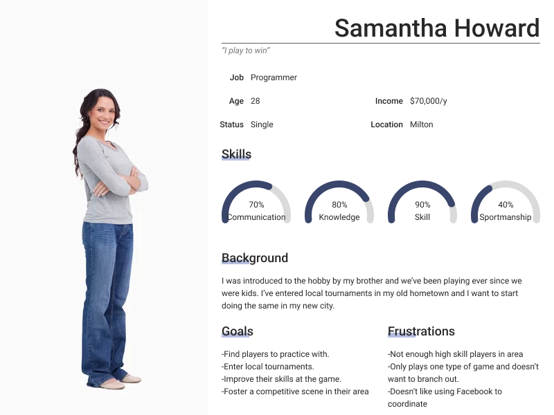
With these insights I set about creating the two types of main personas that I used to model my design after. These two types of personas were the “Casual player” and the “Competitive player” and keeping these two personas in mind helped me focus the scope and aim of my design into creating an app that would cater to finding games to play in for these two types of people.
Design
Initially with these insights I was still focusing on my initial problem statement that focused exclusively on the wargaming aspect of the tabletop hobby instead of a more wide spreading scope. Though after my interviews and competitor research I learned that I could widen my scope to include everything in the tabletop hobby which could include: wargaming, board games, role-playing games, and card games among much else.
The first thing that I decided on my design journey after the research was done was whether or not this would be a phone app or a website app. I eventually decided on a phone app as this would be more conducive to spontaneous enrollment and the creation of listings, with my main reasoning being that someone would create a listing for their game while at their local game store or home.
With this focus decided on began the creation of this app with a simple user flow with my main red routes.
I wanted this process to be as simple and efficient as possible for the users to either create or look for listings in their area to apply to and start playing right away. This would start the user off at their home page where they would then choose to either participate in a local user created listing or they could choose to participate in an event or listing created by a local gaming store in their area. Once the user has found the listing they would like to apply to to play in, they will submit a request to join to either the player or store and have the option to add additional documents along with their application.
If the store or player accepts their request they would receive a notification in a separate chat where they will be able to coordinate with the player who created the listing.
Low Fidelity Prototype
Once this user flow was created I set about creating my very first set of low fidelity wireframes. In this first stage of design I wanted to set up a phone layout that would appear familiar and easy to understand at a first glance by the user. I wanted the user to be able to quickly find what they’re looking for, apply to it, and get started playing the games they wanted to play as quickly as possible.
Link to Low Fidelity Prototype: https://www.figma.com/file/ALagryFUsYTWwyu4HYfpeY/Capstone-1-Wireframe?type=design&node-id=0%3A1&mode=design&t=S3gvV51We4aLrqR6-1
The first thing that I did when creating my initial prototype was to create a homepage that would immediately show the user’s location and the areas of interest around them. These things could either be people advertising their games or game stores in their immediate area. This home page would be curated based upon questions the user would answer during the on-boarding process and this information would be used to show the user listings in their area they might be interested in.
Once the user has found a listing they would be interested in, they would press it and it would bring up the listing page with all of the information pertaining to the game the posting player wanted to play
If the user wanted to apply to the game they would simply apply with the button and submit any documents or lists, whether that be army lists or character sheets to the application which can be reviewed by the listing owner.
Once this application is received and accepted, the two users would then be linked together through the app’s chat system and the two players would be able to coordinate between themselves. This could be used to determine where the game would take place and what time and what the players are comfortable with.
Usability Testing
Once my wireframes were completed and my red routes compiled I set up organizing user interviews and user testing to further refine my design and what sort of pain points a common user may run into while using my design. For this I selected five people who were interested in tabletop gaming and were interested in using an app to more readily find people to play these games with.
My questions were focused on the ease of use of my design and whether or not it was apparent what each section of the app was for and if it was easy to understand and efficient to use.
Some of the questions I asked were as follows:
With the three tabs below the map, what do you think they mean?
Looking at the homepage, what options do you have?
If you were looking to play a game with another person, where do you think you’d press?
If you wanted to look for a specific game to play, where would you press?
Where would you think to press if they accept your submission to their listing?
Once these interviews were finished I compared the feedback and findings I received from the users:
The most major issue which was stated by the vast majority of the interviewees was that the tab sections under the map on the homepage were unclear or maybe even redundant.
Another pointed out flaw with my initial design was that the listing page had too many unnecessary clicks under the main descriptions.
Unclear wording on some buttons and tabs that could be made easier to read and understand
The screens are much too small for modern devices and were hard to work with.
Suggestions for alternate features for future development.
High Fidelity Prototype
After conferring with my mentor and taking the feedback/observations I received from my usability testing, I set about refining and updating my design into its final iteration.
Link to High Fidelity Prototype: https://www.figma.com/file/ZWzqwt4cxqYmOi20LwZfgx/High-Fidelity-Wireframe?type=design&node-id=0%3A1&mode=design&t=gZtVH6lWxmwQm5D3-1
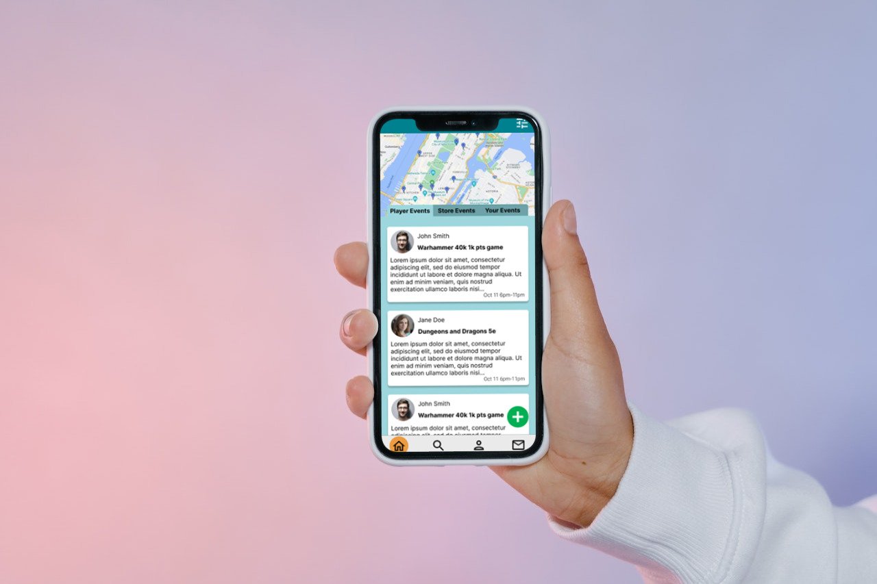
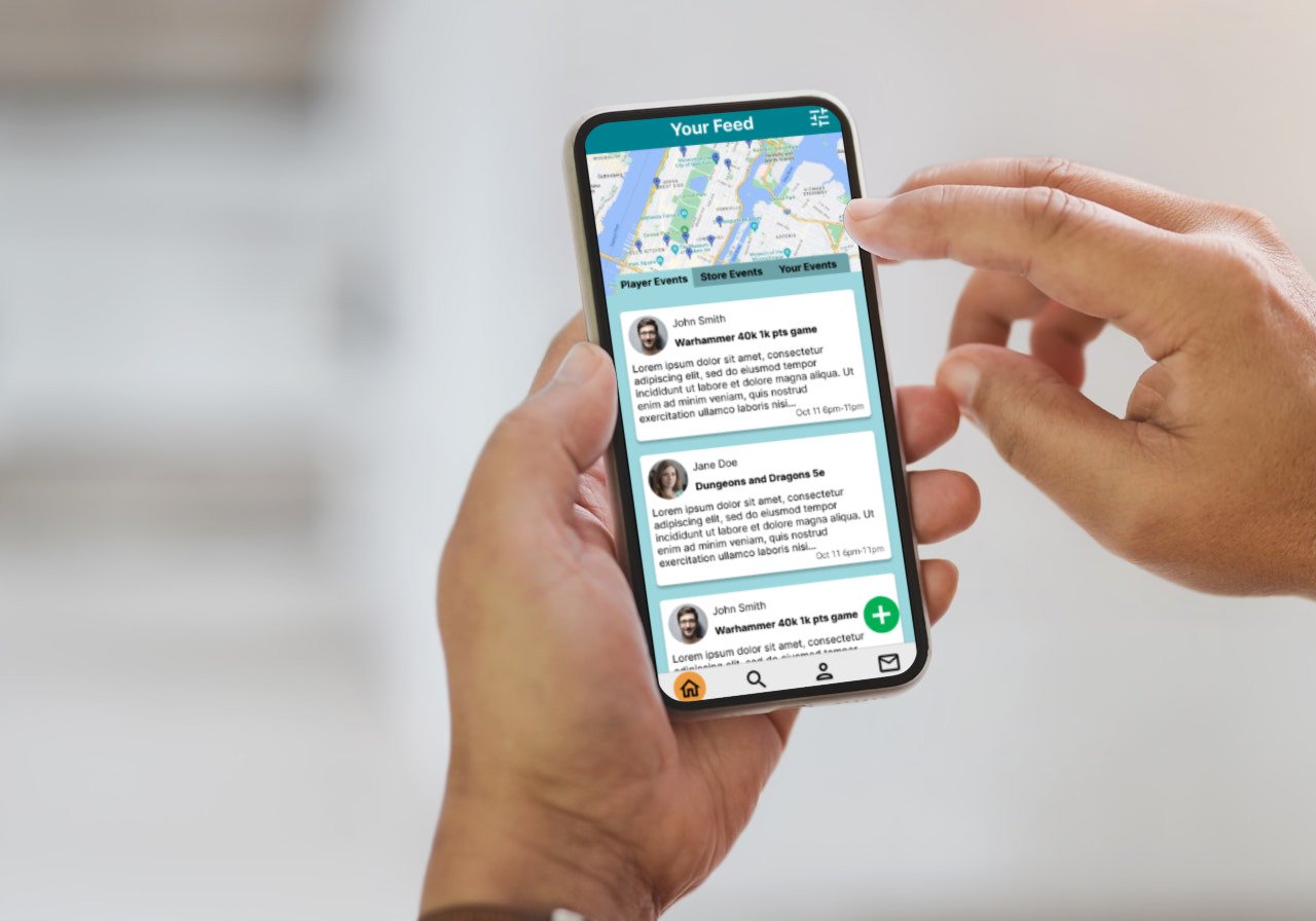
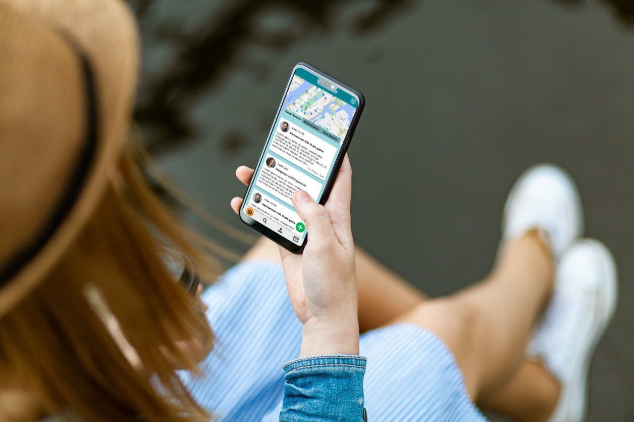
The first bit of advice I took moving forward was to increase the size of my frames to fit a more modern display as compared to the old design which was quite small and made it hard to really visualize what my design was conveying. Along with this increase in size I also added onto the main home page a third tab that included listings/events that the user made themselves to keep track of them and edit.
As per feedback that I received in my usability testing and advice from fellow designers, I removed the dropdown buttons for each of the additional fields of the user listings to remove any unnecessary clicking that didn’t need to be done. Instead I merely expanded the length of the screen and allowed all of the information to be readable all at once as the user scrolled through the listings and read as they went.
With the introduction of the “your events” tab I also went in and created the route for the process of creating your own listing through the app. Once a user clicks on the green plus sign button, the user is moved to the listing creation page. Here they are able to add an image to be more expressive in their post as well as catch the eye of other players. The layout mimics the presentation of the finished listing so to keep things consistent across screens.
Finally the chatting section of the app was further refined to be more in line with other chat features in more social media focused apps.
Conclusion
Outcomes
I believe I’ve created something that will allow gamers in the tabletop space to be able to quickly and efficiently find games in their local area. Between taking into consideration what users needed and what the market was lacking in terms of apps, Tabletop Radar will be a good alternative to finding people to play with.
Challenges
This was my first foray into the world of UI and UX design so having to learn everything as I went along was quite the challenge and at times proved to be incredibly difficult. The main topic of my project too also provided some unforeseen difficulty as well as there were not many metrics or even any competitors to pull inspiration or compare my work to so at times it felt like I was flying blind and had to rely on gut feelings.
What I learned
I’ve learned quite a bit from this first project, between how to structure my work, engaging in concise interviews, ideating, and being able to admit when something wasn’t working and starting from a new perspective. I’m definitely looking forward to applying the knowledge and the practice I’ve gained from this project into my future designs.


